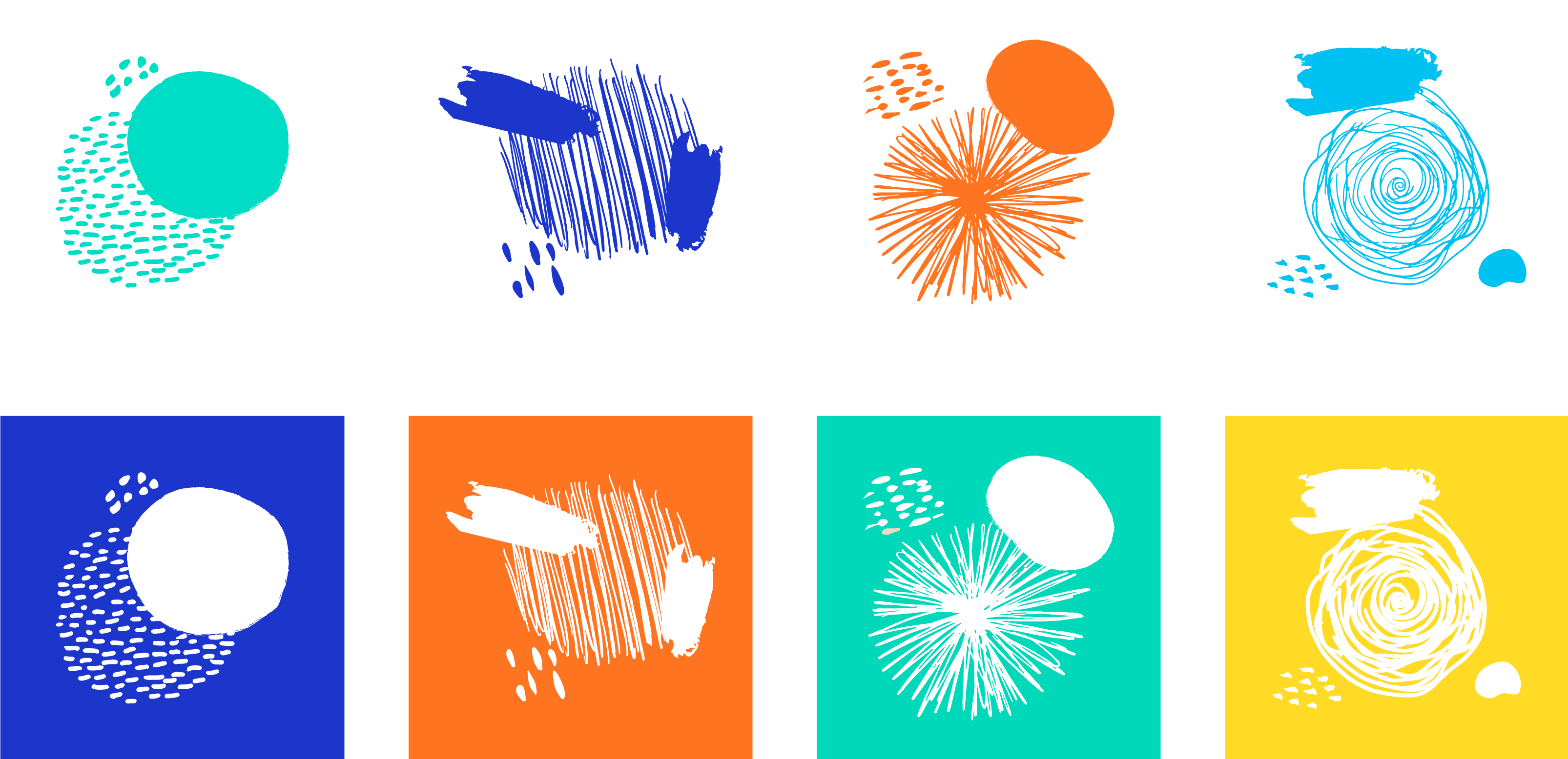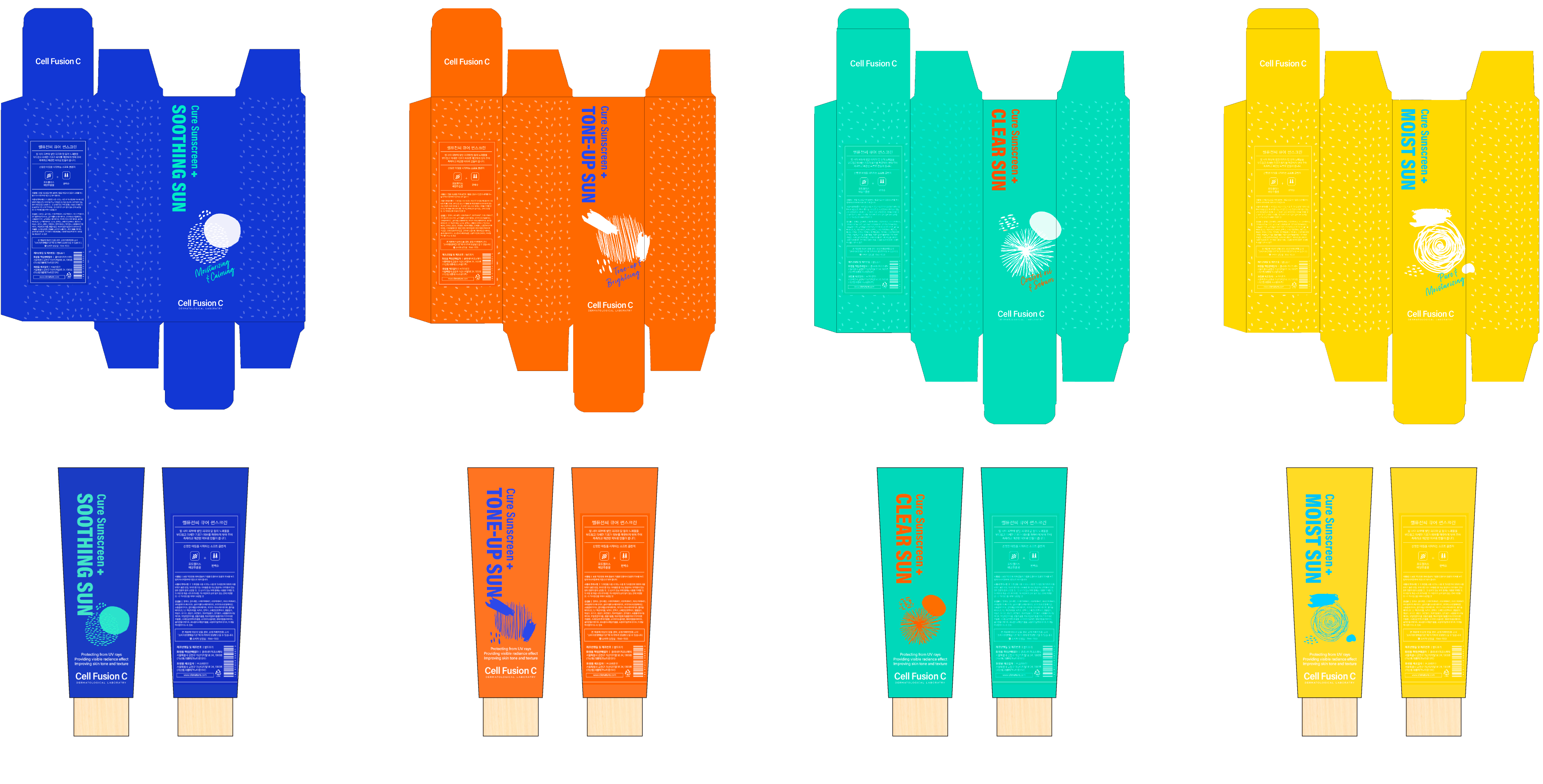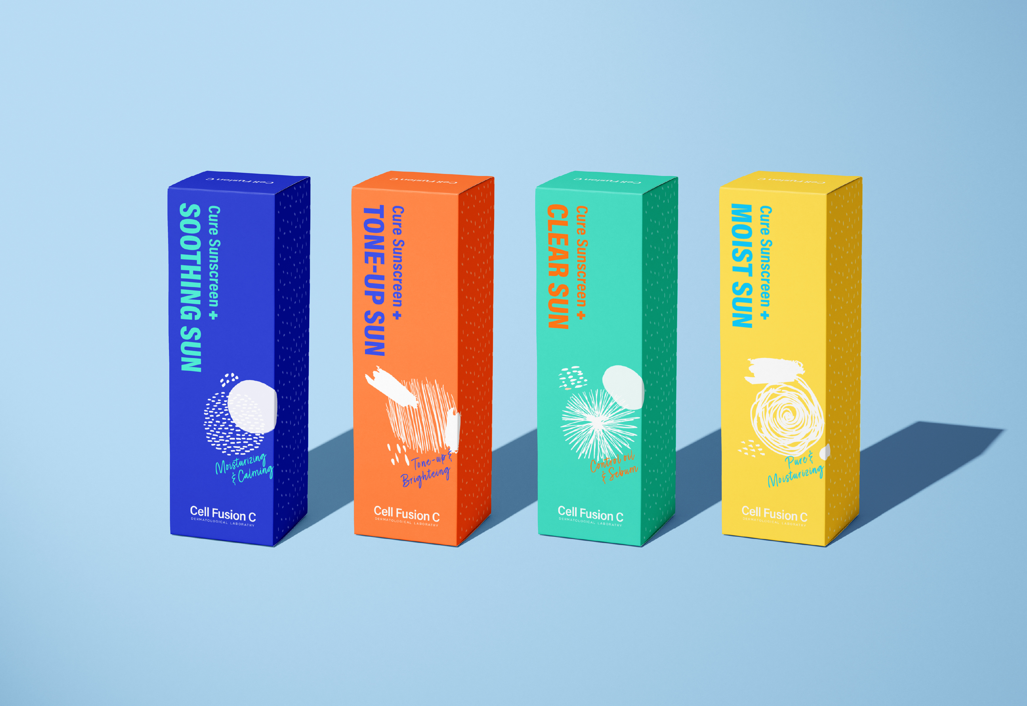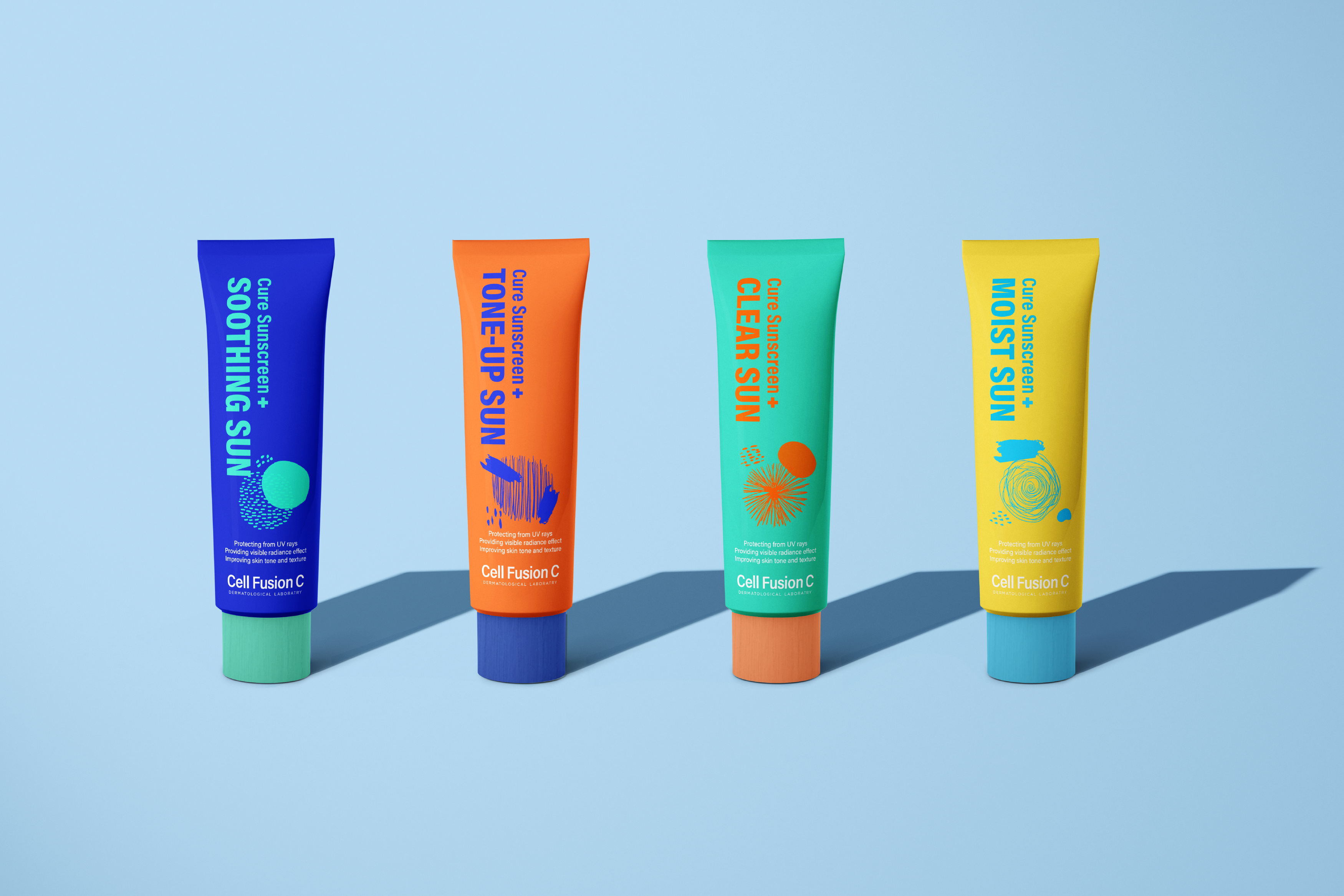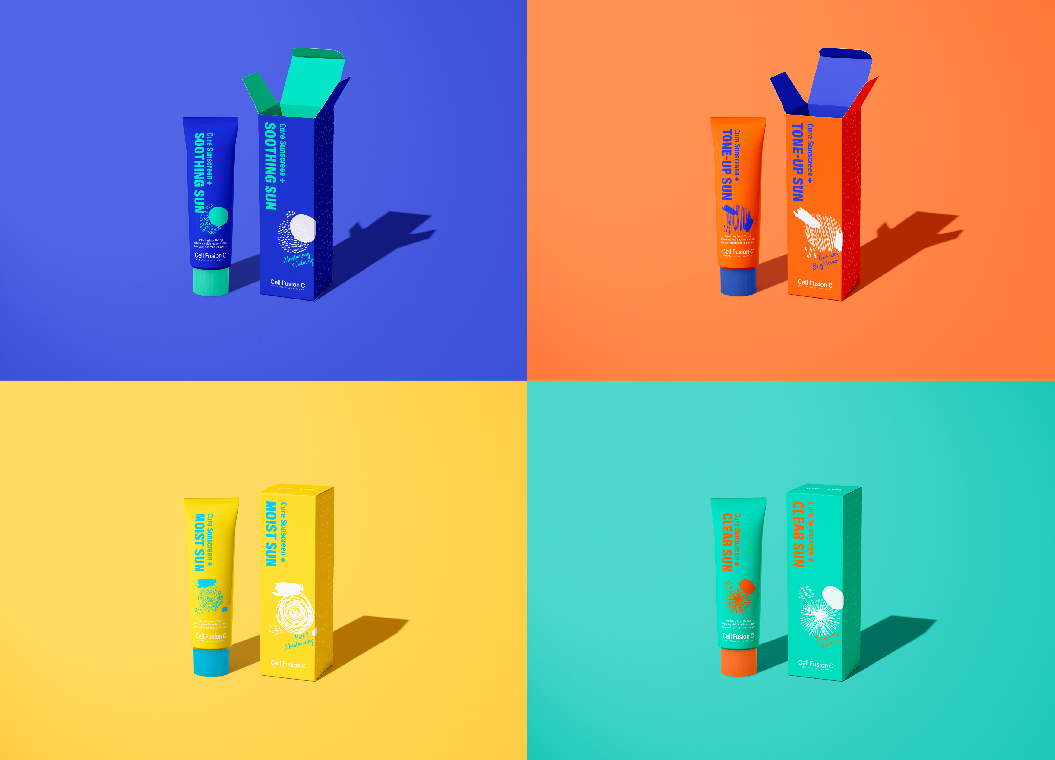

Rebranded an existing brand called, Celfusion C, considered the environmental, social and economic impacts. Sustainable design is the approach to create products and services that have considered the environmental, social, and economic impacts from the initial phase through to the end of life. I rebranded an existing brand called, Celfusion C, turning it into an eco-friendly design.
The existing logo feels like rather nutritional supplements brand due to its element, the plus sign top right. Some features make the logo feel complex: Too much English text embed into the logo and three main different colors, orange black and red were used at the same time. The brown glass bottle with a complicated logo makes it look like an old medicine brand.

Aluminum is not renewable.
Stickers on aluminum make it difficult to recycle.
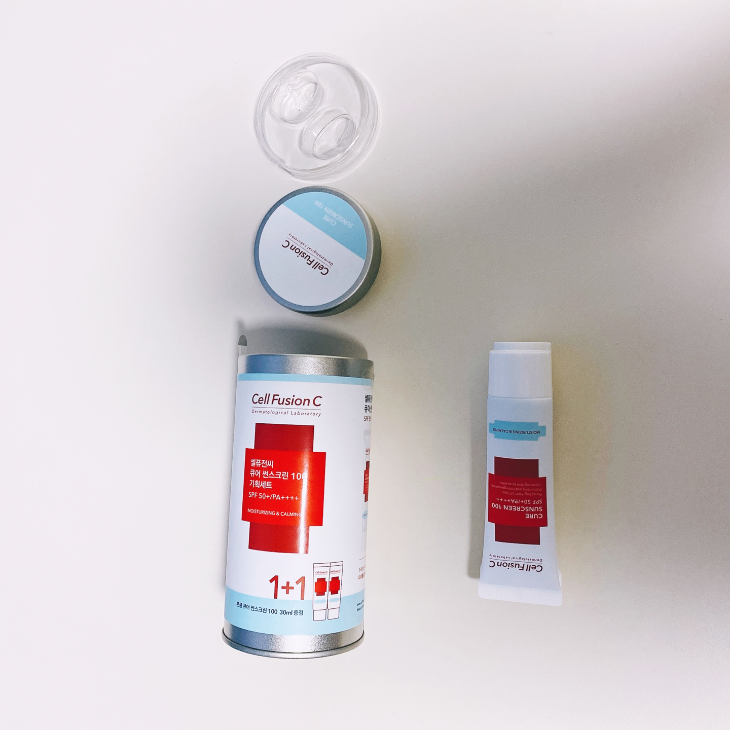
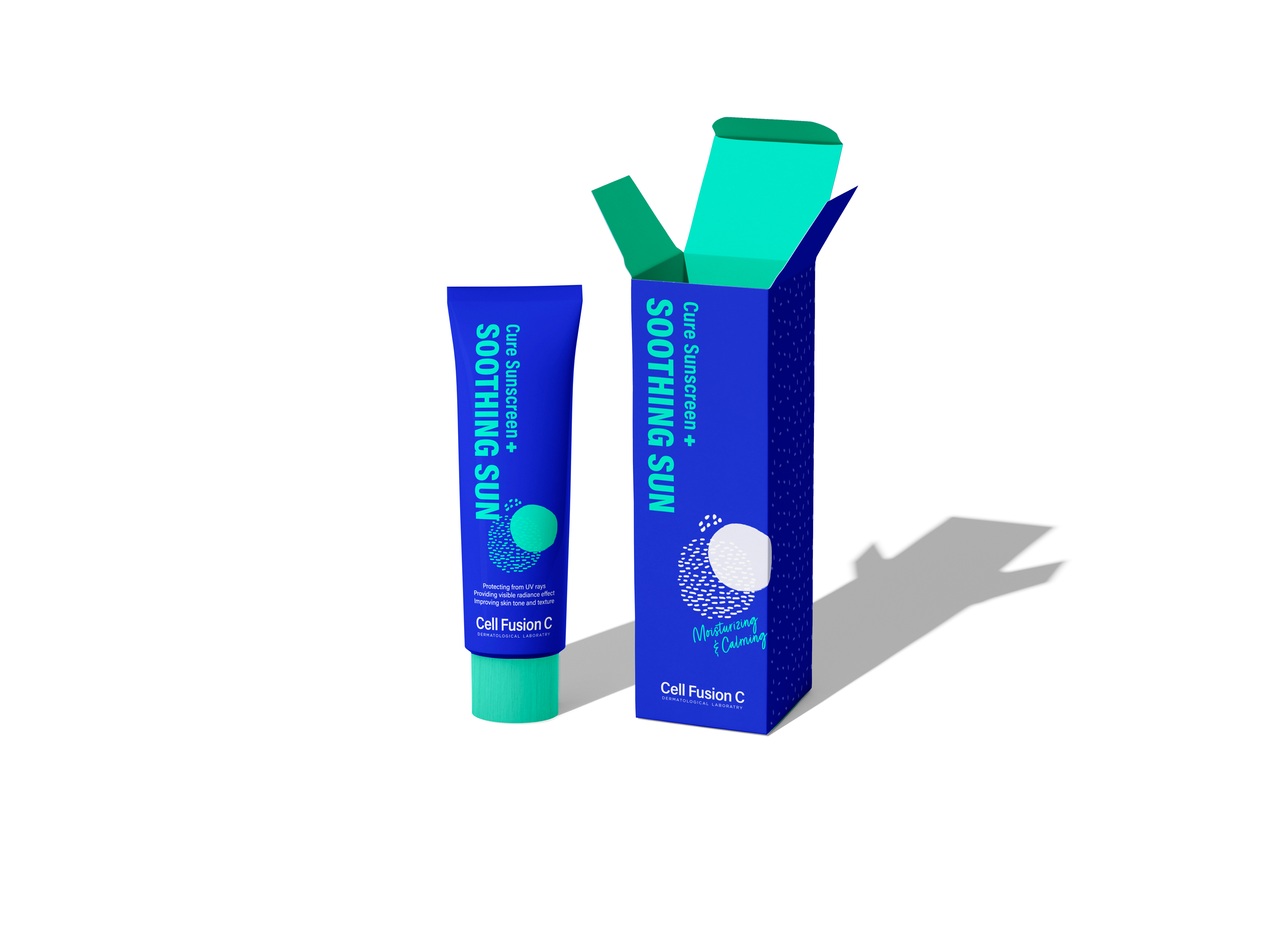
Too much packaging waste including
plastic prop and aluminum stuff.
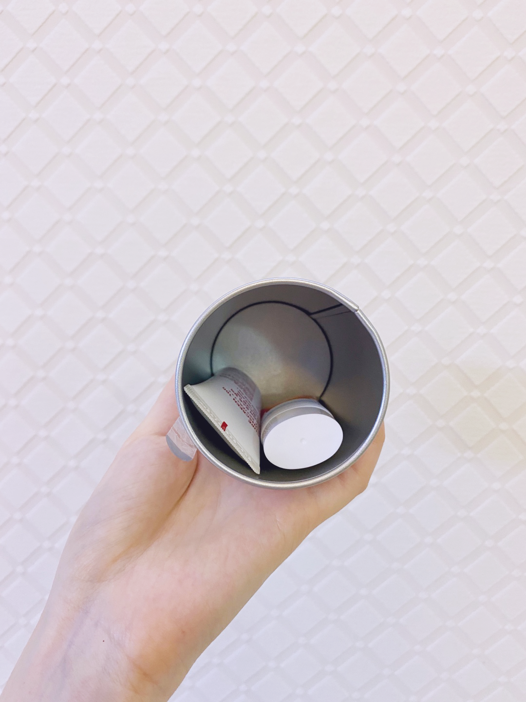
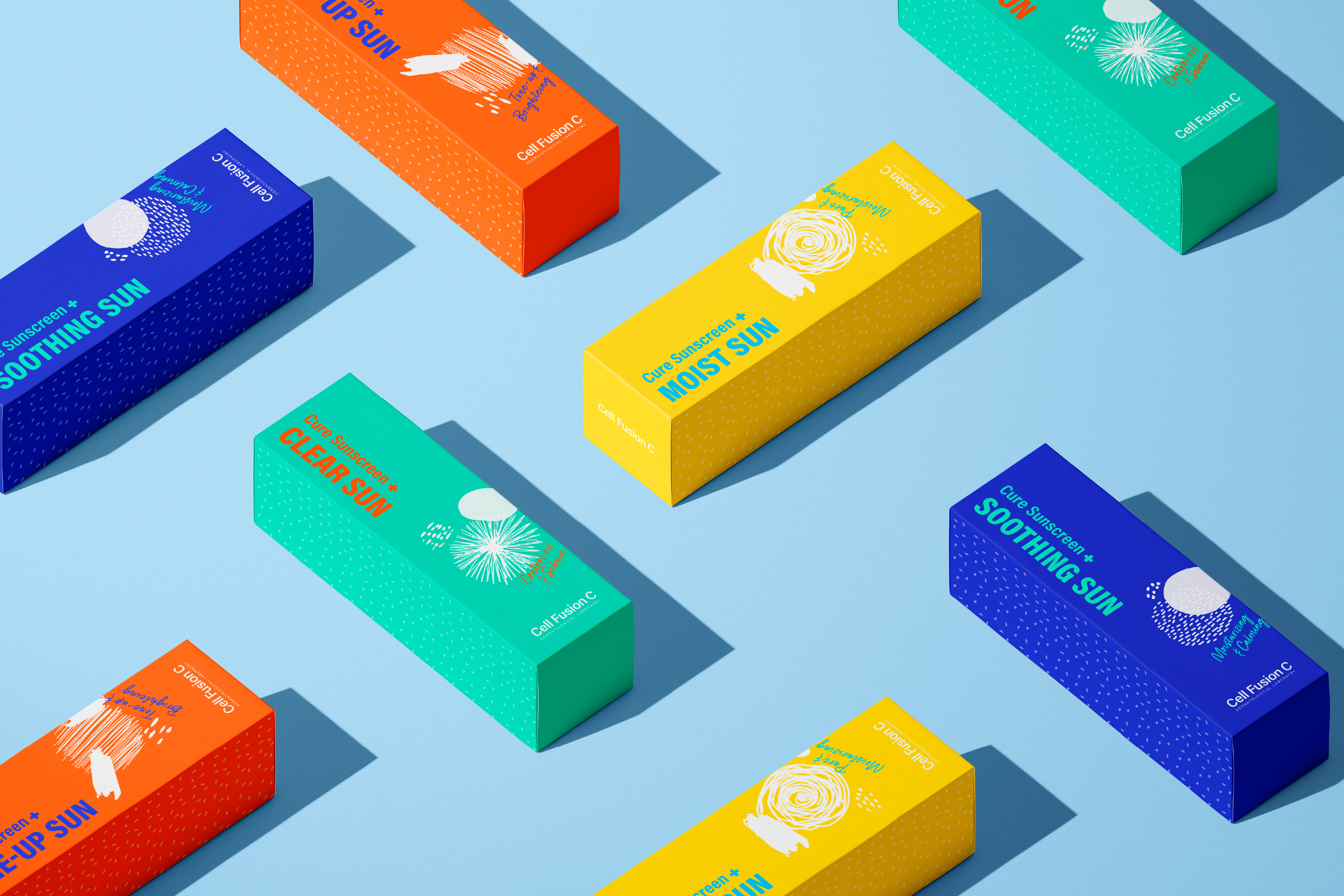
The packaging is too big for
two pieces of little sunscreens.