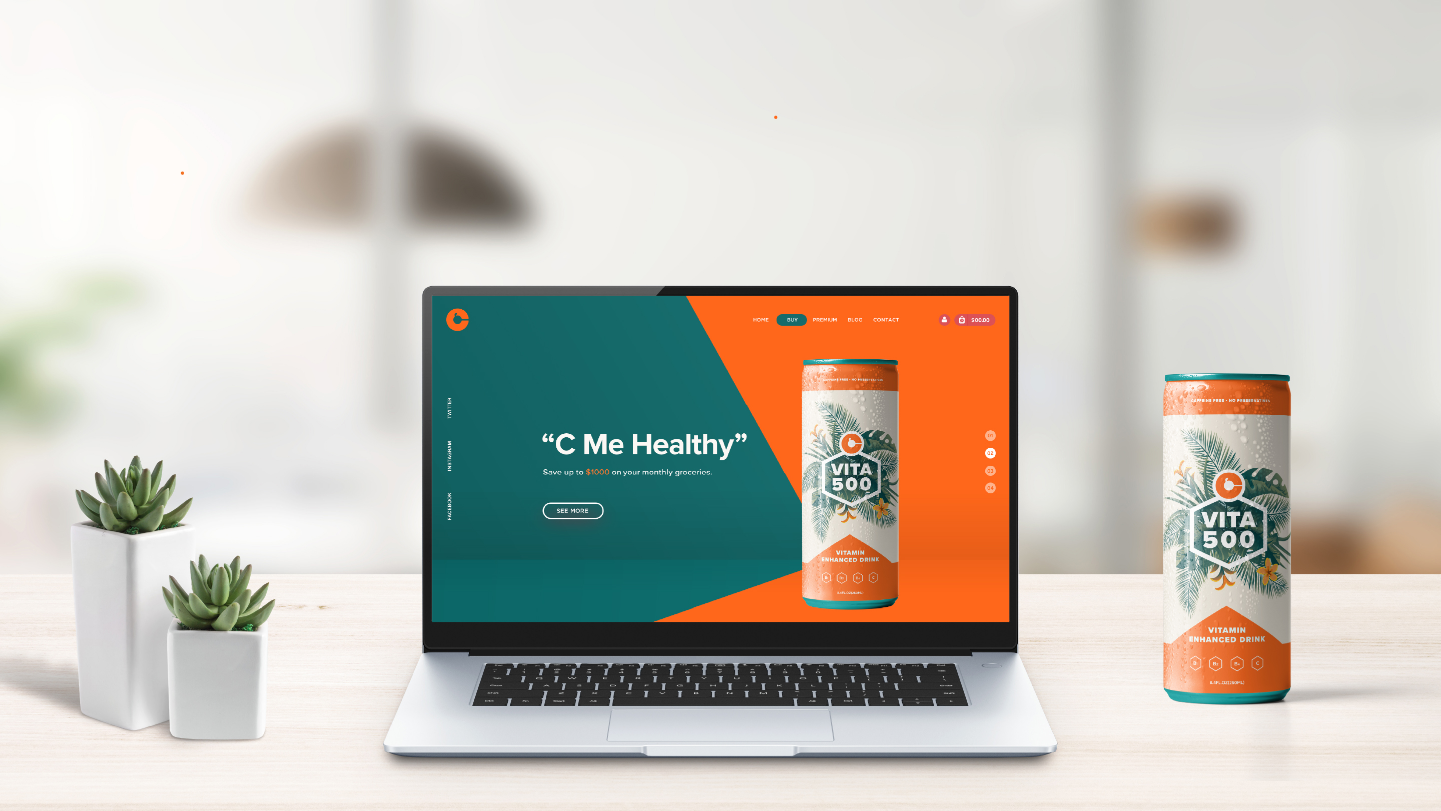
This project was about re-branding the existing Korean energy drink, Vita500. The brand highlights its Vitamin C as its feature with many other healthy ingredients. The new visual identity keeps its original attribute, creating more bright, positive and energetic personality targeting both teenagers and the 20s.
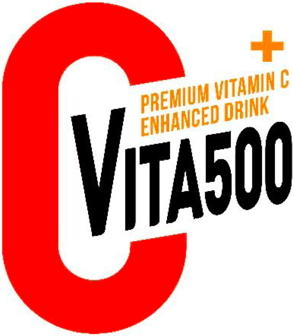
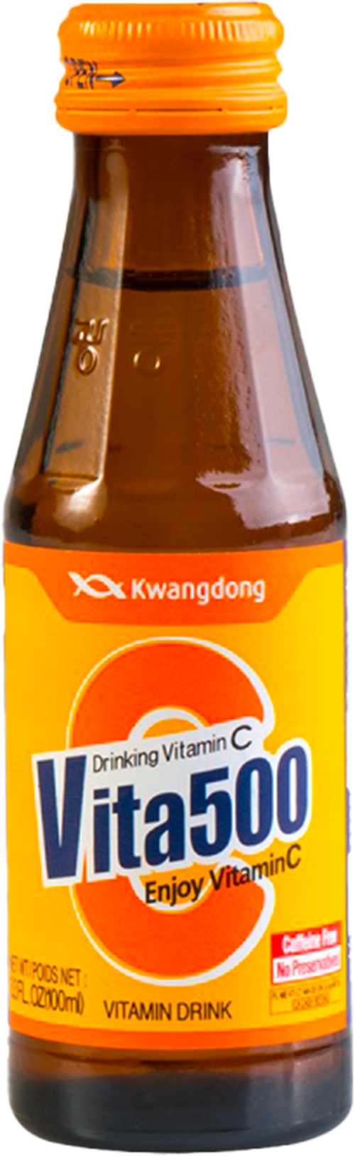
The existing logo feels like rather nutritional supplements brand due to its element, the plus sign top right. Some features make the logo feel complex: Too much English text embed into the logo and three main different colors, orange black and red were used at the same time. The brown glass bottle with a complicated logo makes it look like an old medicine brand.

The new design aims to have a refreshing, bright and energetic feeling.
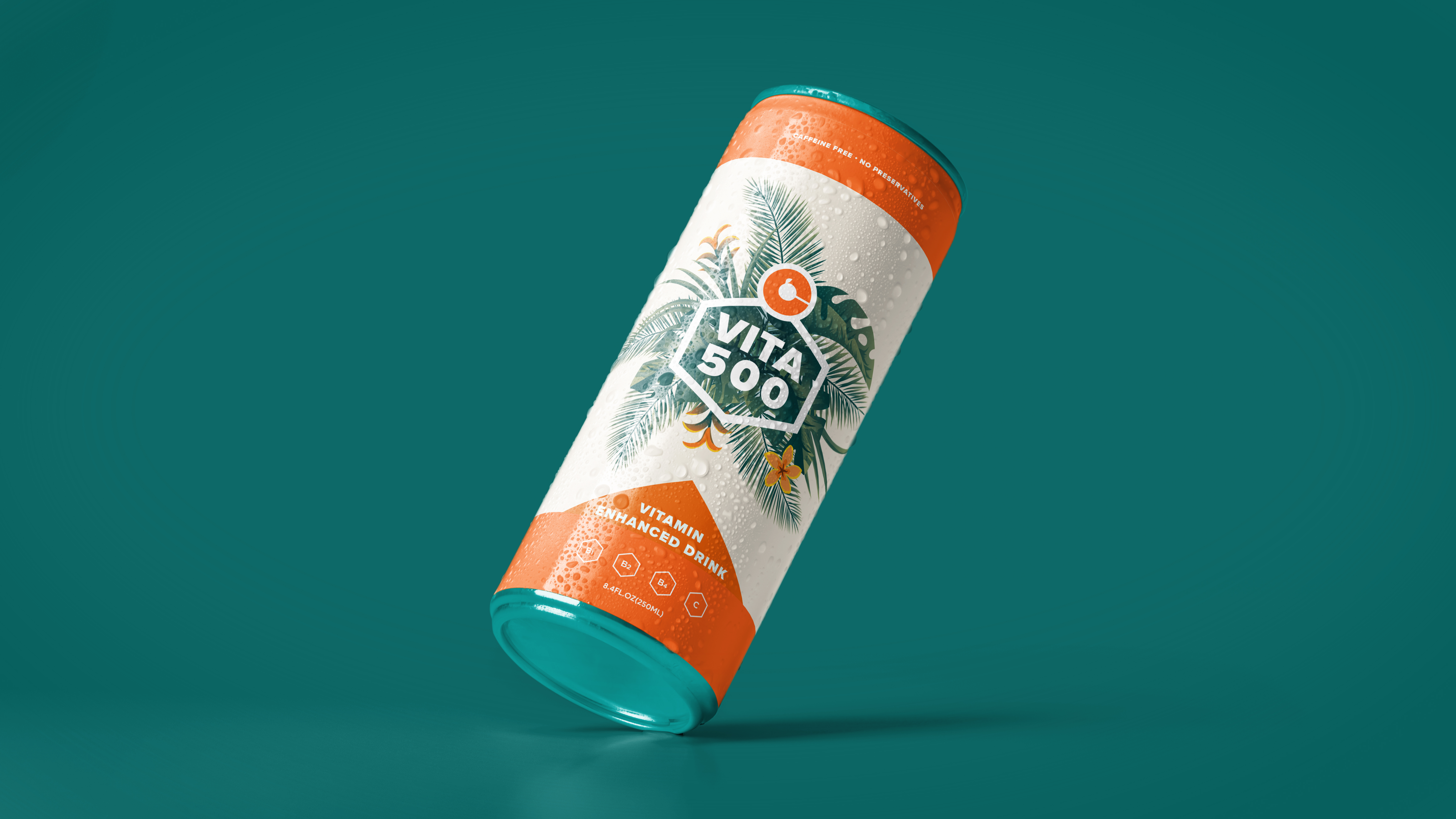
Vivid red-orange color meant to deliver powerfulness and fruit shape inside represents its tropical flavor and it main feature Vitamin C. Overall becoming more youthful to create brand appeal to a younger audience.

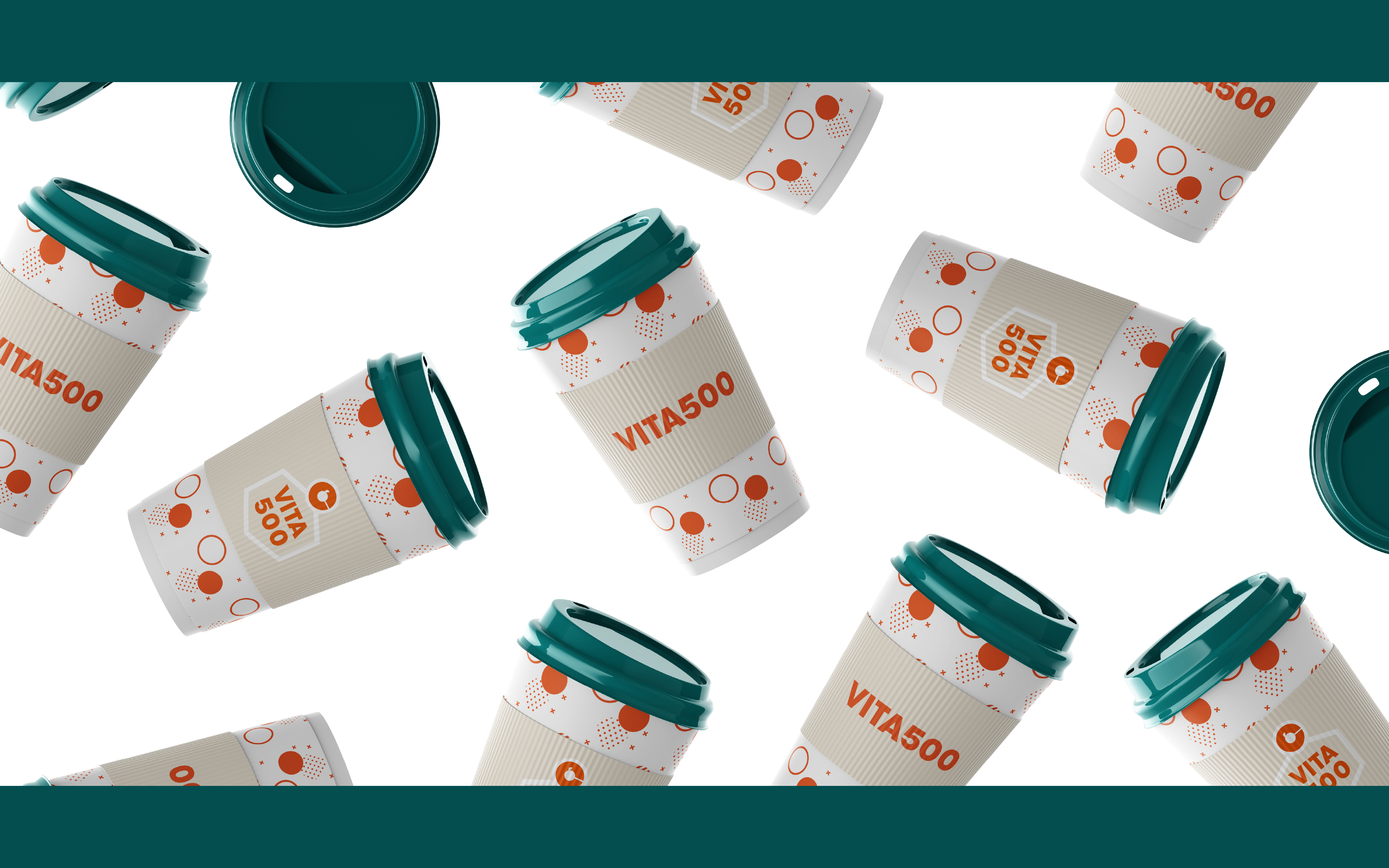
Three attributes are embedded in this new packaging.
The tropical pattern behind the logo represent refreshing tropical flavor.
The towered orange triangle at the bottom delivers energetic feeling.
Hexagon shapes Refers to one of its brand attribute, healthiness.